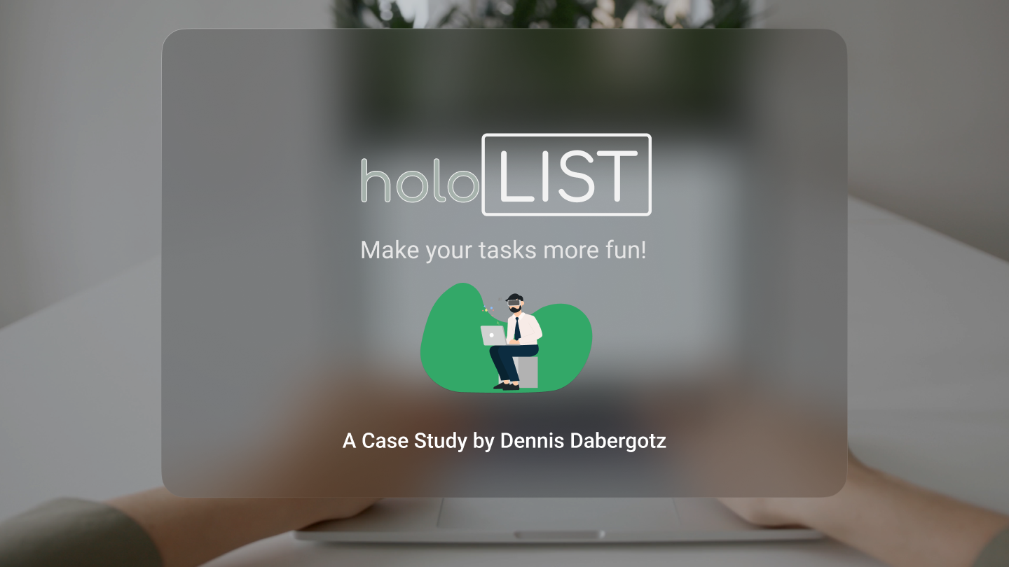
After giving the try to have an AI to take a look over my portfolio, with the result being that holoList was the project with the highest potential, I decided to pick it up again.
The AI was not the default but rather trained on portfolios, UI/UX design, case studies and everything about job hunt in this regard. Though the result over the portfolio was not so random.
Back to the board
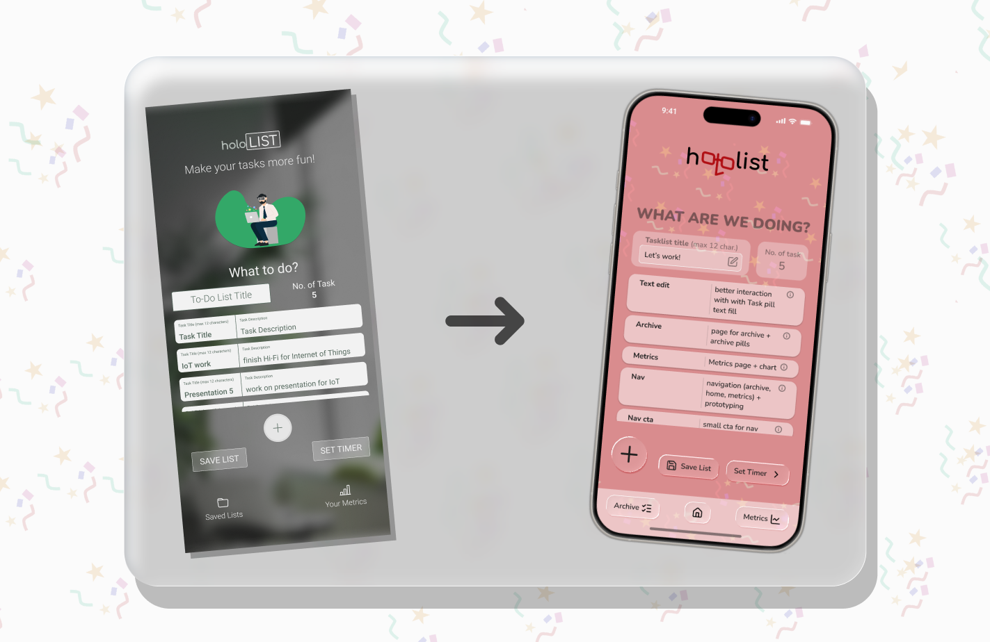
The good or bad thing about holoList was that I didn't like the style I had in the older version. So I decided to go back to the drawing board and start over.
The main theme of the project was to lighten up boring & monotonous work, though bringing a bit of fun & color into it was the deal.
old design of holoList to new design comparison
So I went for a more playful and colorful design, with softer edges and a more friendly look.
The color palette added way more colors than before, with a mix of pastel colors and vibrant colors.
The new design also features more screens that were not in the original version or just indicated, such as the archive for saved list or a newly time modes selector, a settings screen and more.
These new screens help to bring the app to life and make it more complete.
For a full insight into the project, check out the case study on Behance.
Optimizing for better access
09/09/2025
Case Study re-design for German Jobcenter thumbnail
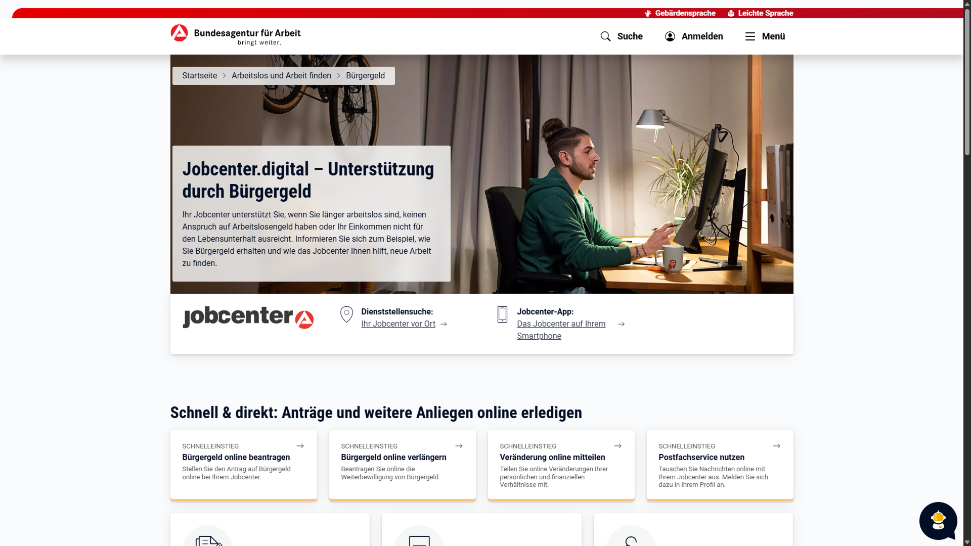
I logged in, now what?
When I received my annual "Bürgergeld" paperwork from the Jobcenter, I didn’t expect it to come with a recommendation to use their new online portal.
My first thoughts were, "About time" and "Let’s see how this goes." I typed in the address from the letter, logged in, and immediately got stuck for a minute - not exactly a great start.
The process of filling out the forms didn’t go nearly as smoothly as I’d hoped.
First, I was met with text boxes big enough for an essay. Then came a wall of cards, each with its own form - none of which applied to me.
The option to check ‘I don’t need any of these’ was hidden off-screen, so I had to scroll down to even find it.
And just when I thought I was making progress, the ultimate roadblock hit: the page went down for maintenance. *Sigh*
Long story short: it took me over a week to complete a form that was only four or five pages long.
The trouble I had, I like to conquer
After all this trouble, I couldn’t help but think: If I’m already struggling, what about the people who aren’t as used to being online?
So why not reach out to the Jobcenter’s IT team and work together on a better version of the site, right?
I applied for an internship, and to give the IT team a clearer idea of what I had in mind for a redesign, I created a mock-up of what one of the pages could look like.
Spoiler: I got rejected.
What could have been
Nonetheless I'd like to share my approach of the re-deign.
Original top menu and hero section of Jobcenter Digital
Let's start with the Hero Section of Jobcenter Digital.
The site uses a card-based design for most elements.
While the cards share a similar look — a slightly lighter background fill, dark text, rounded corners, and a drop shadow — they behave inconsistently.
Some cards are clickable, others contain links inside, and some are just static text boxes. On hover, a line is highlighted and the drop shadow becomes thicker.
My approach was to clearly differentiate the designs and only keep the card layout where it truly made sense.
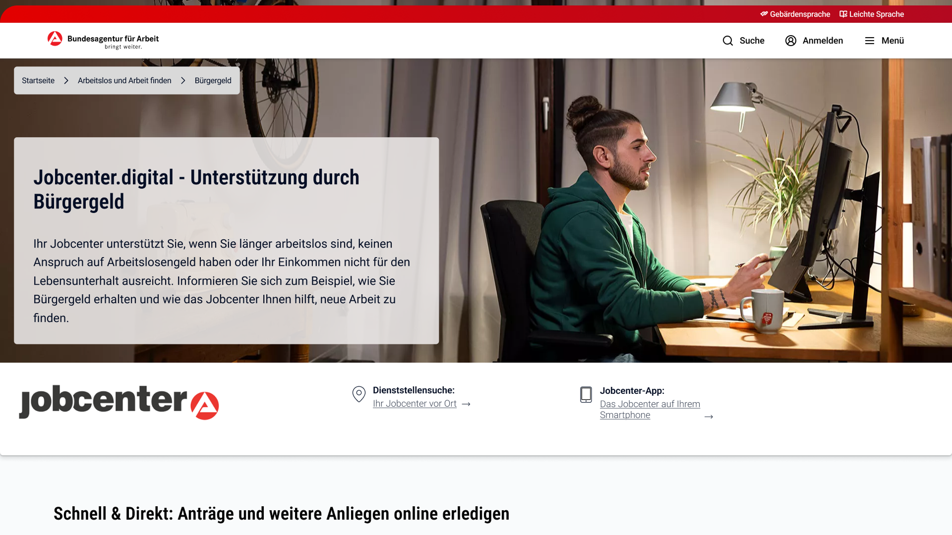
Header & Fast Links
Re-design: top menu and header of Jobcenter Digital
Basically, I kept it close to the original. I widened the header to use the full width (like in the mobile version) and gave the top menu more padding.
Re-design: Fast link cards
On the original page, the fast and direct cards only stand out with a yellow bottom border and an arrow indicating they lead to another page. Otherwise, the cards look almost identical.
The yellow that is used was nowhere to be seen elsewhere and feel as an inconsistency in the overall design.
To break up the uniform look of the cards, I added icons that clearly represent the forms they link to.
I also made the cards more visually distinct by enlarging them slightly, placing a red button in each card’s highlight color, and moving the arrow inside the button.
The yellow bottom border from the original now comes in red and only comes up on hover, creating a subtle, interactive cue that guides the user’s attention.
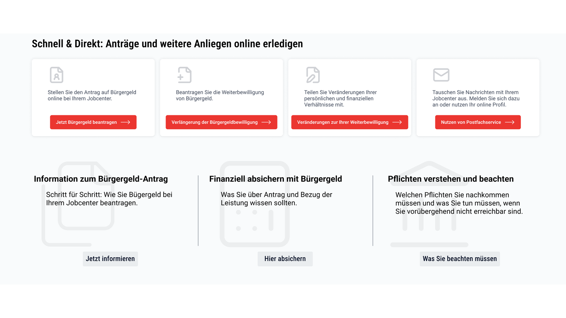
Original: "Bürgergeld" information & other topics
Below the fast-link cards is information about "Bürgergeld", including details on finances and the associated rights and duties.
In the original design, these cards feature large icons that feel out of place, likely from a different icon set.
Their overall look is also very similar to the fast-link cards, making them blend together rather than stand out.
To revamp the look while keeping the original elements, I used icons from the same set as the fast-link cards.
I placed them subtly in the background so they don’t stand out too much, but still help convey the purpose of each card.
To give users a clearer idea of where each card leads, I added a CTA labeled to reinforce the purpose of the card.
More Information
Re-Design: "Bürgergeld" information & other topics
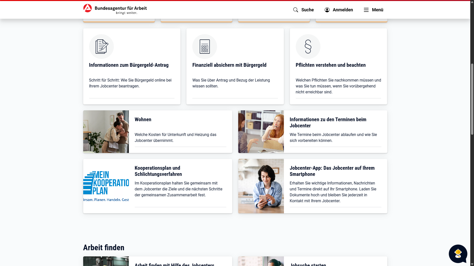
We’re still in the Fast & Direct section, but the card style changes once again.
These cards didn’t change much in the redesign.
I mirrored them (switching the image from left to right), made the image span the full width, and added a text box overlay with a semi-transparent white background.
An arrow, which highlights on hover, indicates that the card is clickable.
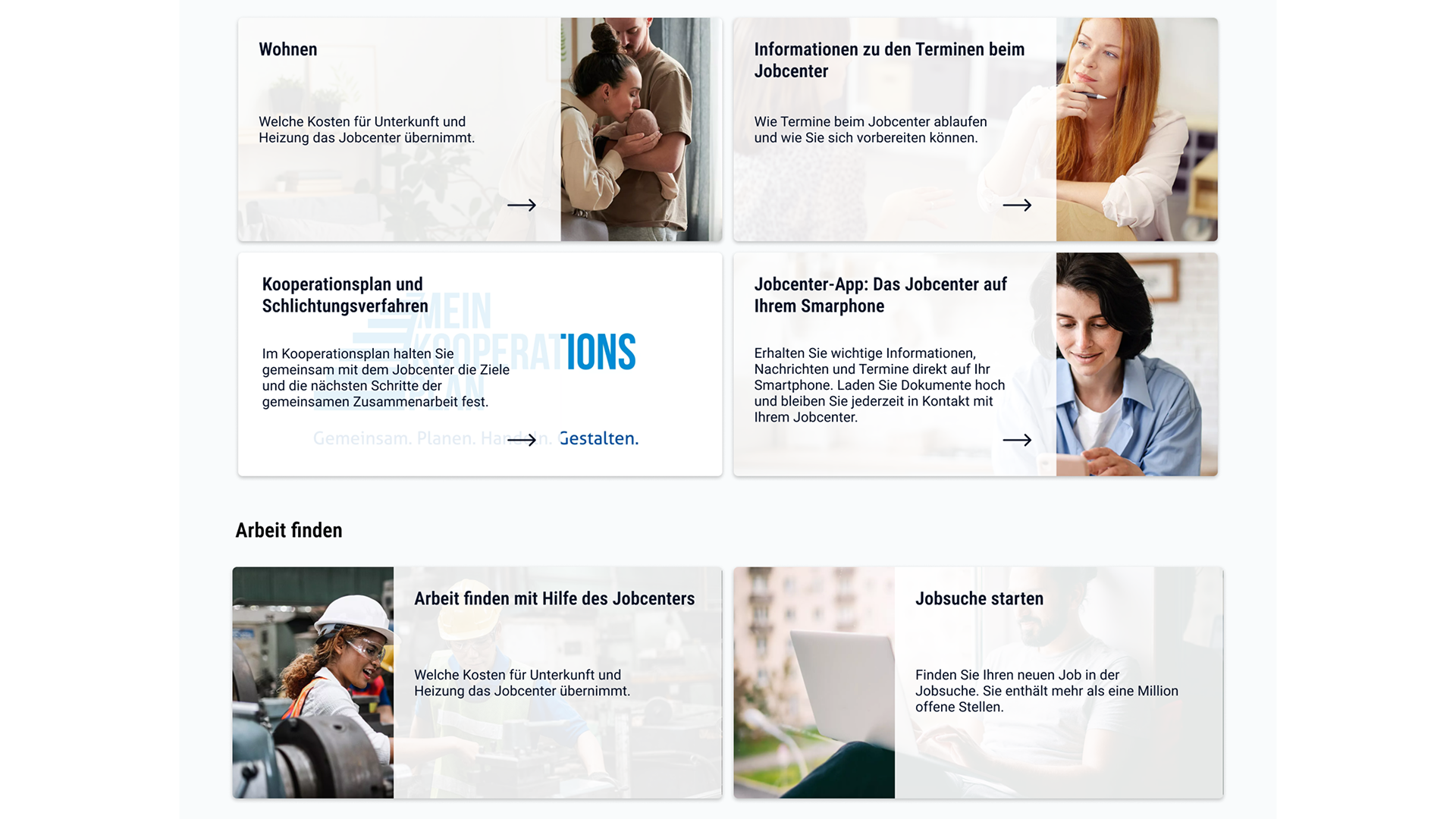
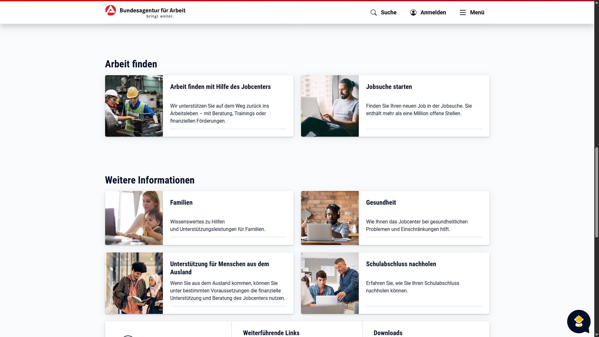
Find work, further information & help
In the 'Arbeit finden' section, the cards reuse the image-based design from the section above.
To differentiate them, the image stays on the left with the text on the right, but the image still spans the full width of the card.
FURTHER INFORMATION
Original: find work & more information
The trend in card styles from the previous two sections continues, but since the topic changes, a different style would be more appropriate.
Re-design: further information & other help
To differentiate the style from the previous cards, the image was cropped into a circle with the drop shadow being dropped (pun not intended).
The text block was resized to match the circle, and on hover, the entire card is highlighted in grey.
OTHER HELP
Original: other help card + footer
The last card, for the other help section, consist of three subsections:
find your Jobcenter
Link to the site of ministery of employment & social
download links for flyers & information for "Bürgergeld"
This change was made to open up the content, so it’s no longer a single card.
The first subsection includes an icon (a location pin), so I added matching icons to the other two subsections for consistency.
Aside from these few changes, nothing else was altered in the redesign.
Conclusion
I started the redesign as an intend to further strengthen my inquiry for an internship, hoping to collaborate with the team on improving the site for people who aren’t familiar with using the internet or have never been online before.
I had trouble navigating the site and finding the information I needed (and I’m still searching for one feature that was suggested for future use).
Even though it didn't got me what I had in mind with the re-design, I still like it.
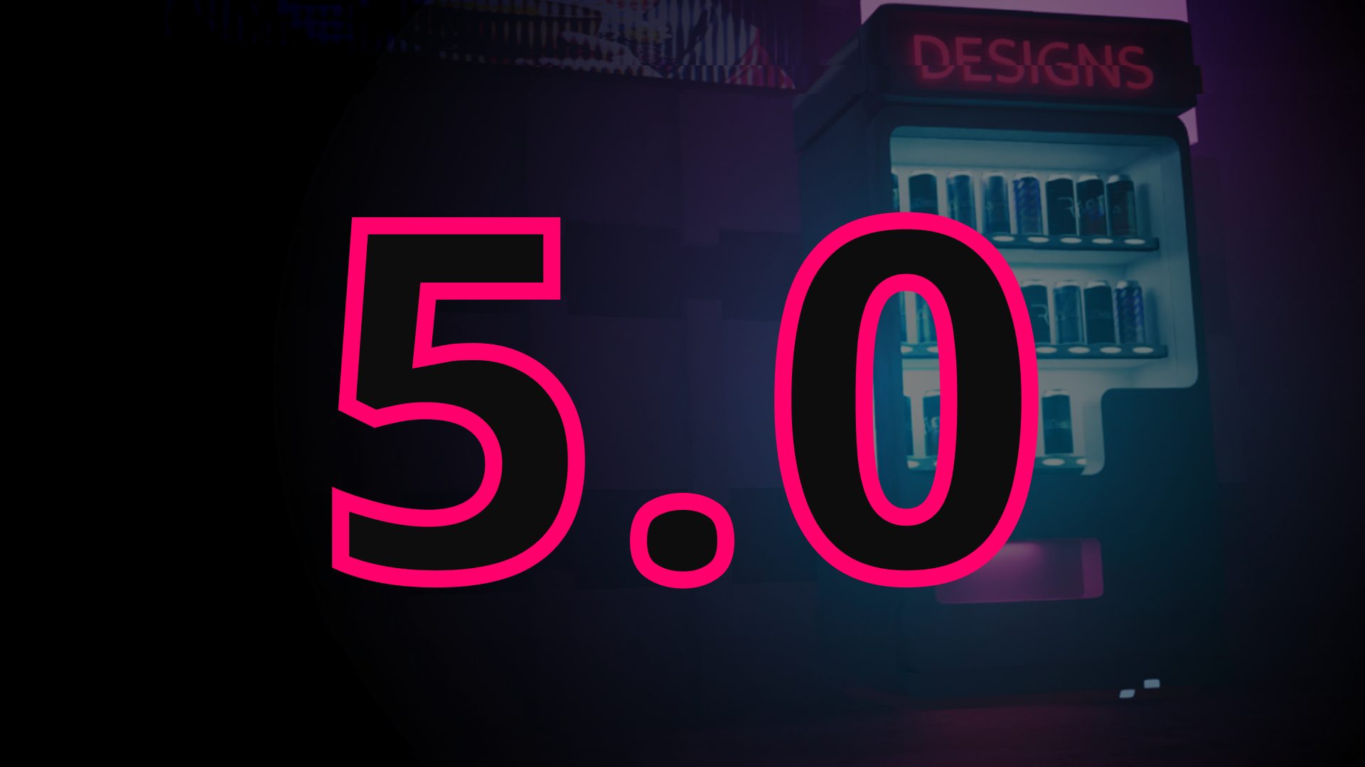
5.0 - A new dawn
01/09/2025
dabergotzDesign launch of 5.0 thumbnail
It is time for a revamp
After receiving some honest feedback on both my application process in UI/UX and my previous portfolio (dabergotzdesign.com), I knew it was time for a revamp.
Welcome to dabergotzDesign.com 5.0 - a version that came sooner than expected.
So, what’s new?
I redesigned the site almost entirely, moving towards a cleaner, flat style with a minimal color palette: black, white, and a magenta highlight. While the look is simplified, I kept the interactive elements on desktop using Rive and unicorn.studio.
The new design was inspired by my Design Vending Machine background and my logo, which set the tone for the overall style.
Looking back at version 4.0, one piece of feedback I received was, “tries so hard to be cool.” Honestly, that was fair - I had thrown together elements I thought were fun or trendy without much cohesion. This time, I kept only the parts people genuinely found engaging, especially in the portfolio, which is now fully built in Rive.
Overall, I reduced unnecessary effects and pop-ups, making the site simpler, more focused, and a better representation of myself as a designer.
I’m back with fresh motivation and a clearer vision - and I’m excited to see where this new portfolio takes me. Hopefully, it opens the right doors and helps me land my next role in UI/UX design.
Update 4.1
15/05/2025
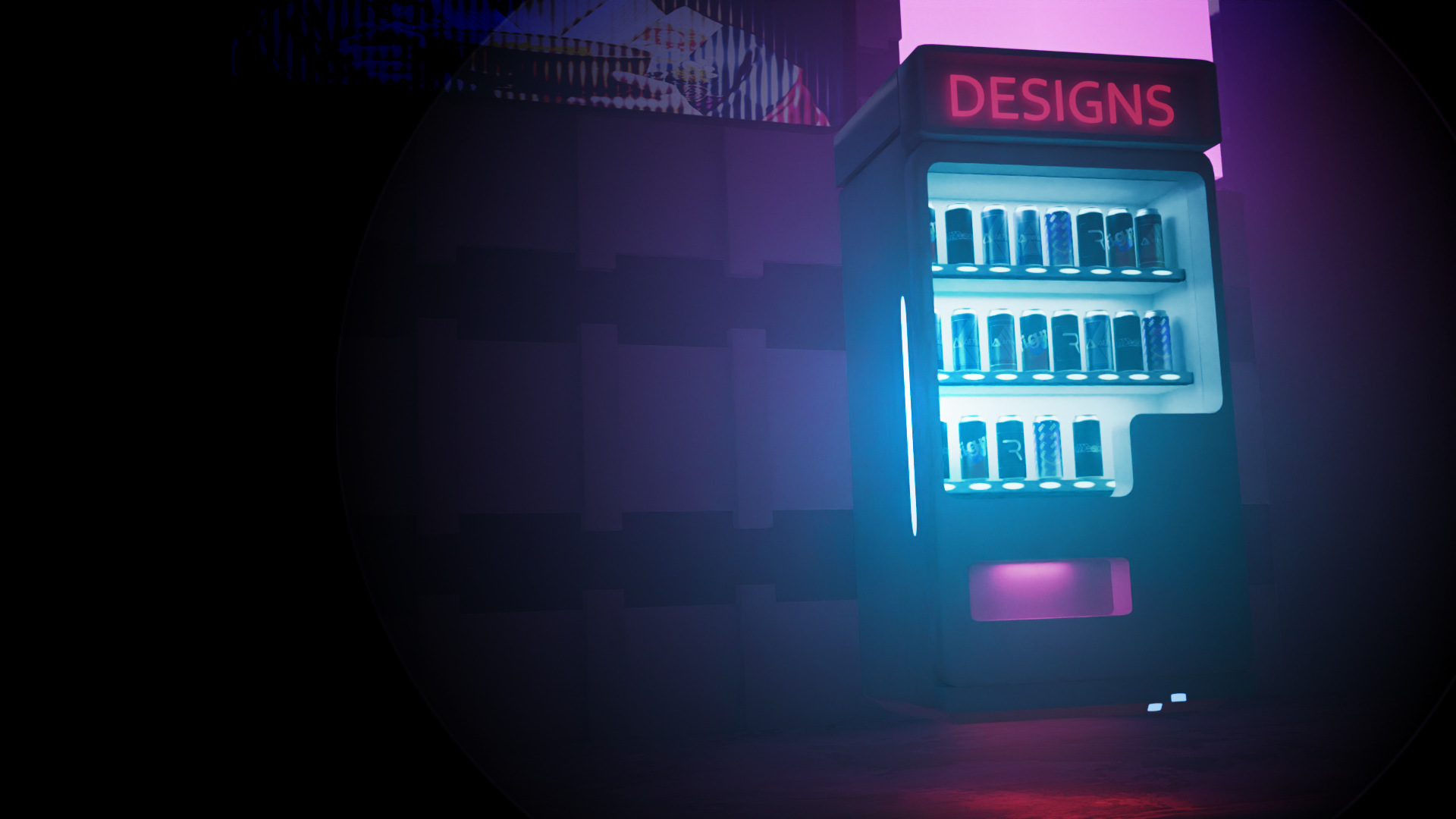
dabergotzDesign background of vending machine
Portfolio update & more Rive
I overhauled the presentation of my portfolio in a new gallery. Now it not only prevents you with a list of the stuff I'm presentig but is also
fully made in Rive!
But these are not the only changes, the old presentation of my portfolio - the accordion - is now viewable on mobile and tablet.
Next change would be my 'welcome section' with a fresh new title and a new background.
The background featuring the vending machine was one of the suggestions from ChatGPT, and I recreated the AI-generated image in Blender.
Also the update will hopefully make the performance on mobile better, if not I'm gonna take a look further into it.
Until the next update!
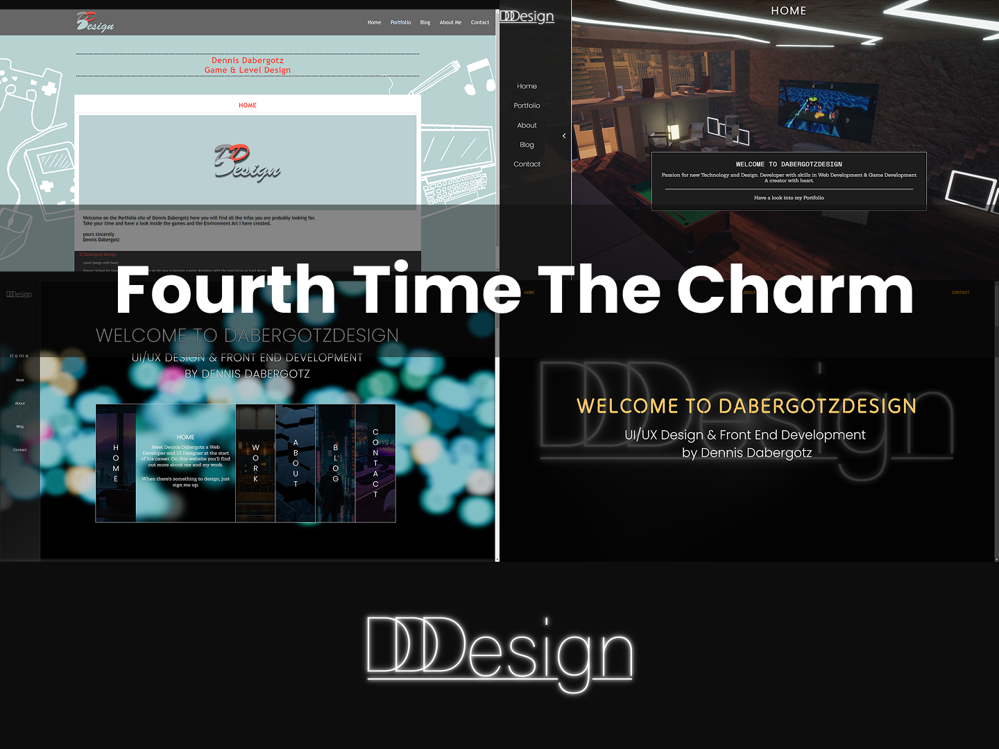
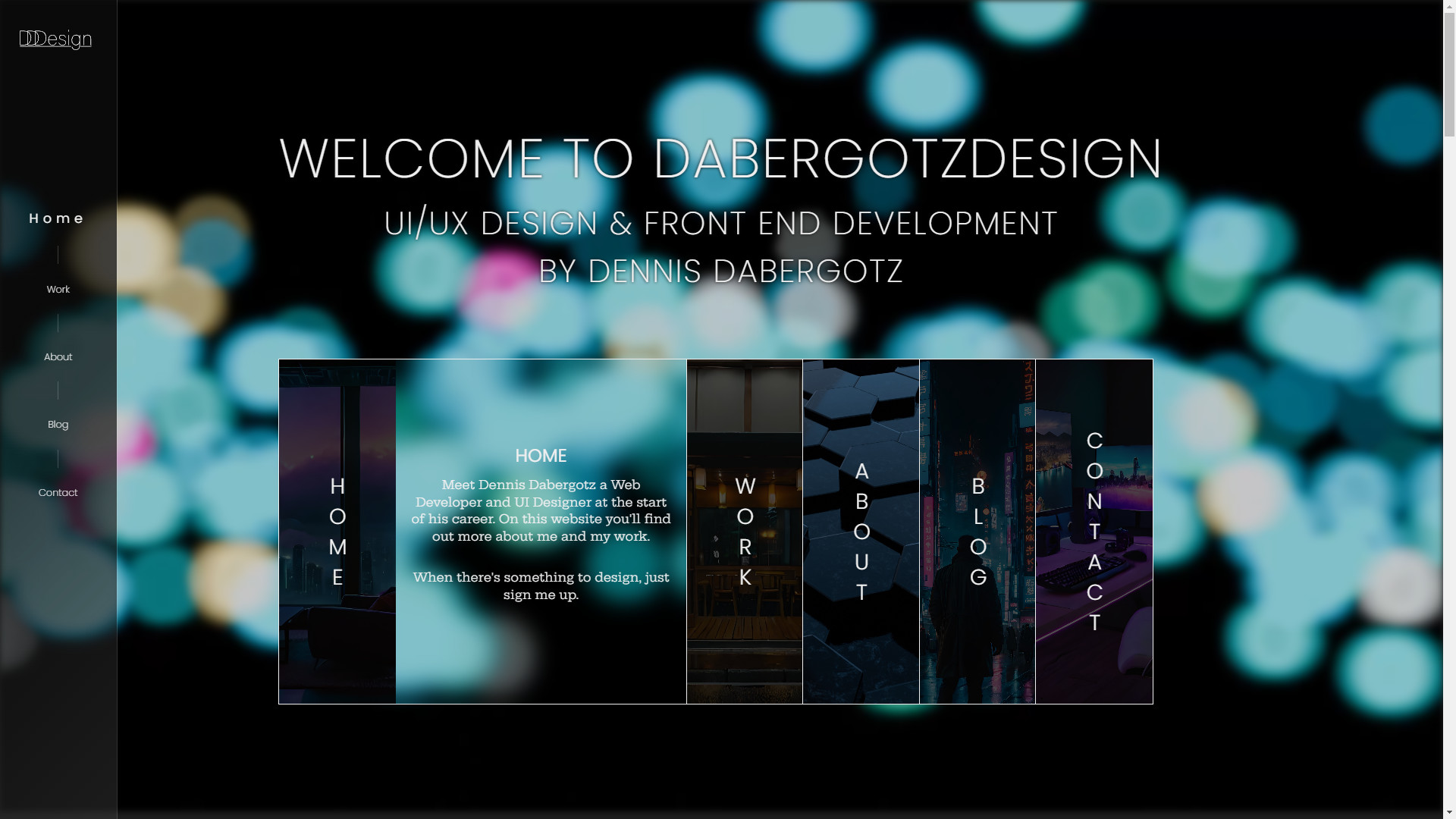
Initiate 4.0
10/04/2025
Evolution of dabergotzDesign site
Fourth times a charme, right?
To bring in new stuff like Rive, unicorn.studio & a new idea, dabergotzDesign is now launched in 4.0!
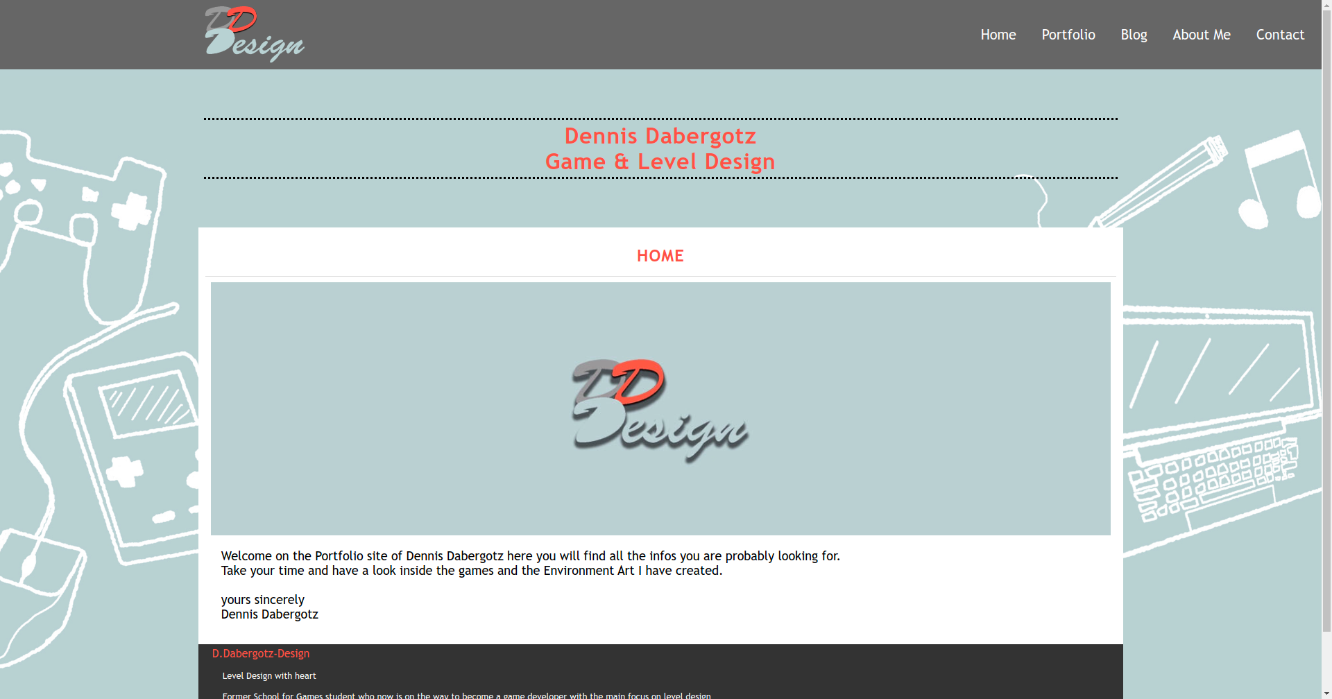
dabergotzDesign on Jimdo
The first version of my portfolio site was centered around my role as a Game & Level Designer. I built it using the no-code tool Jimdo.
In terms of design, I largely based it on one of Google’s Presentation templates, making a few customizations,
such as incorporating different background illustrations and a more playful font.
dabergotzDesign version 2.0
After graduating as Web Developer, I knew it was time for a portfolio redesign.
An article about the changes is written in an older entry.
dabergotzDesign version 3.2
As time goes by, some adjustments were made both in Unreal & the site.
You are here now
And now we are at 4.0, with new toys to play with and a more dynamic site.
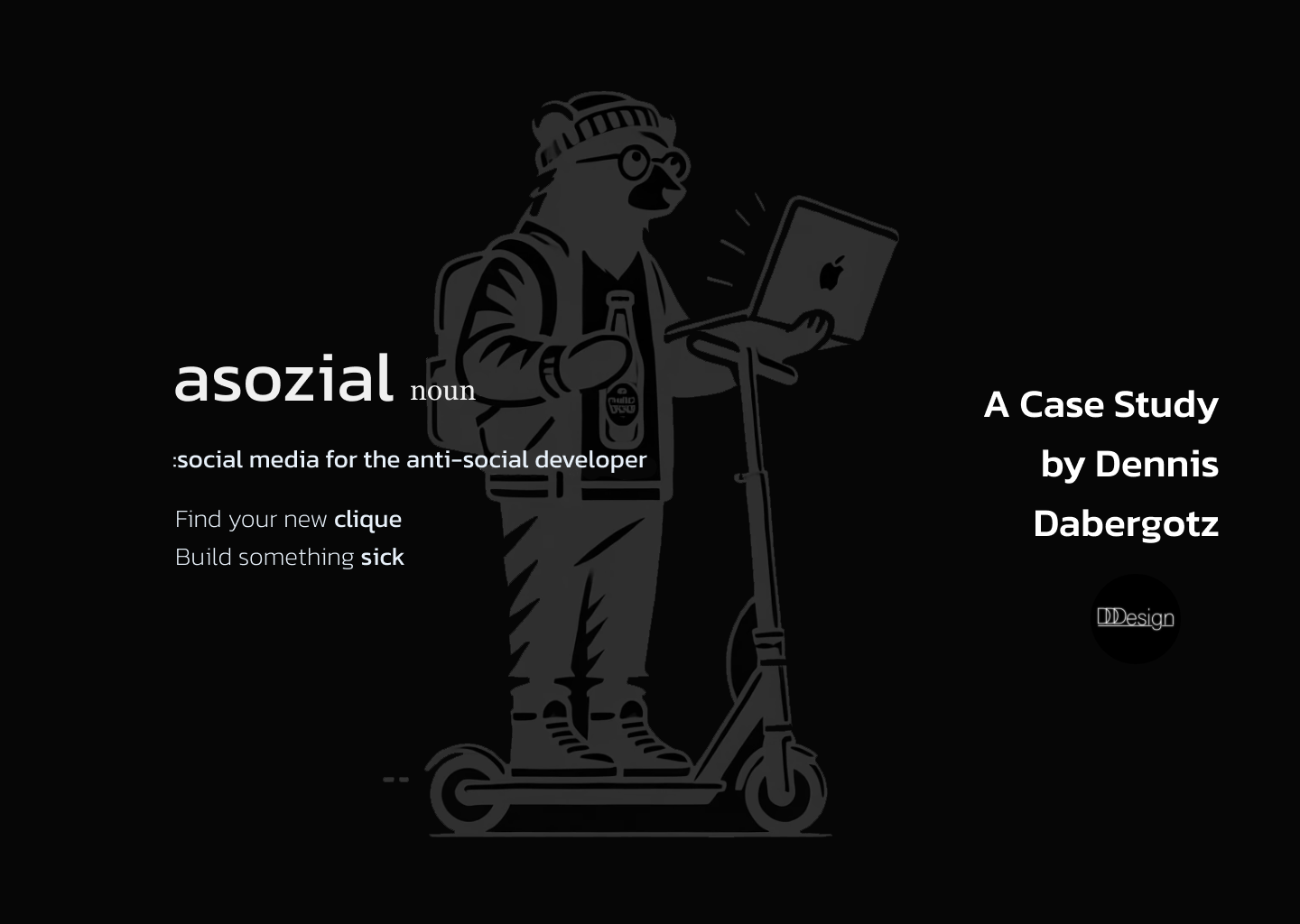
I was working with a client from the platform "asozial - a social platform for anti-social developers" together, to design the feature for matching users & projects.
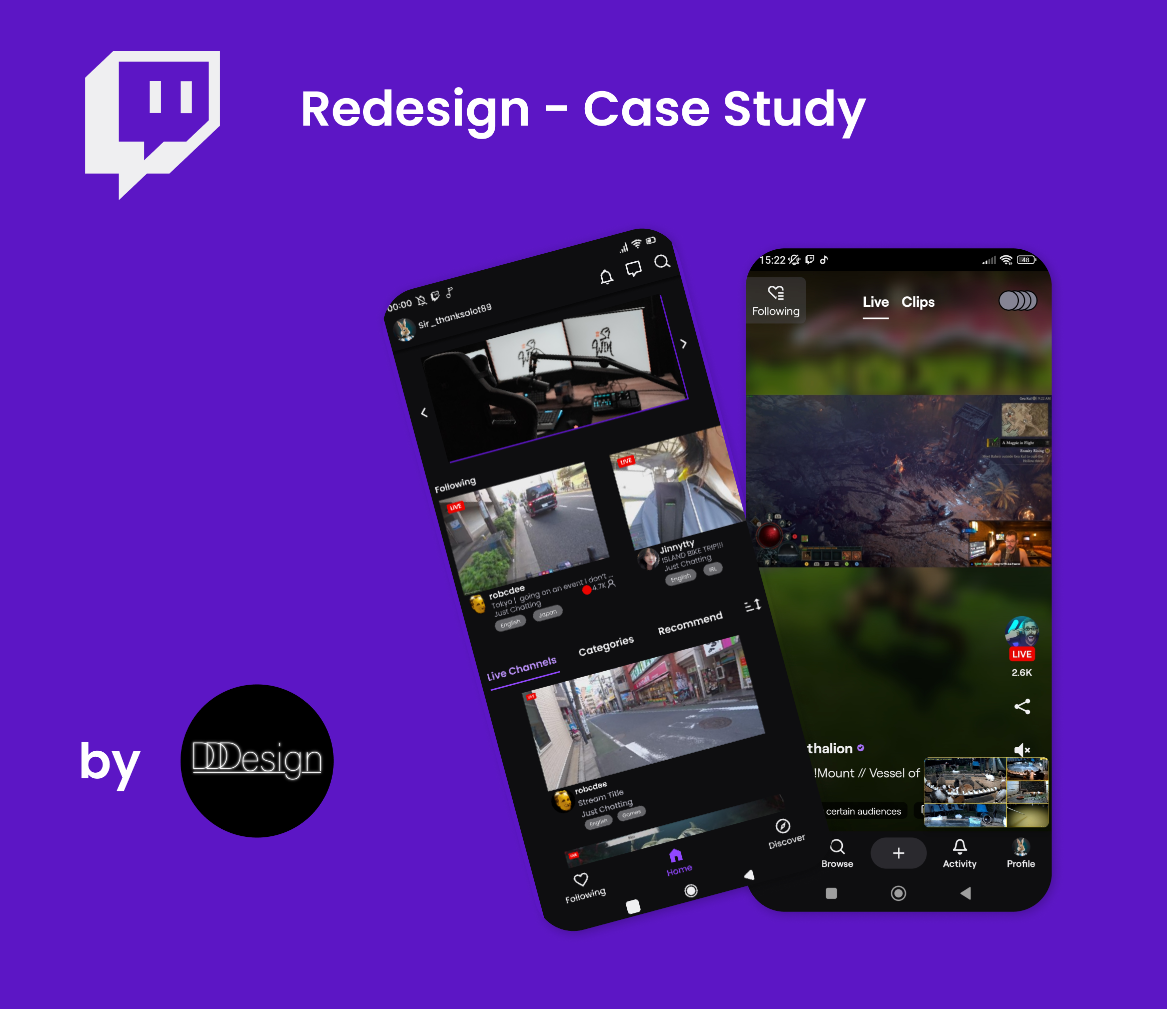
What's up everybody and welcome to my stream... I mean case study
When Twitch updated their mobile app, the community's response was largely negative. In response, I took the initiative to redesign the app to better meet users' needs.
To be or not to be - Case Study: Ironhack - E-commerce
21/10/2024
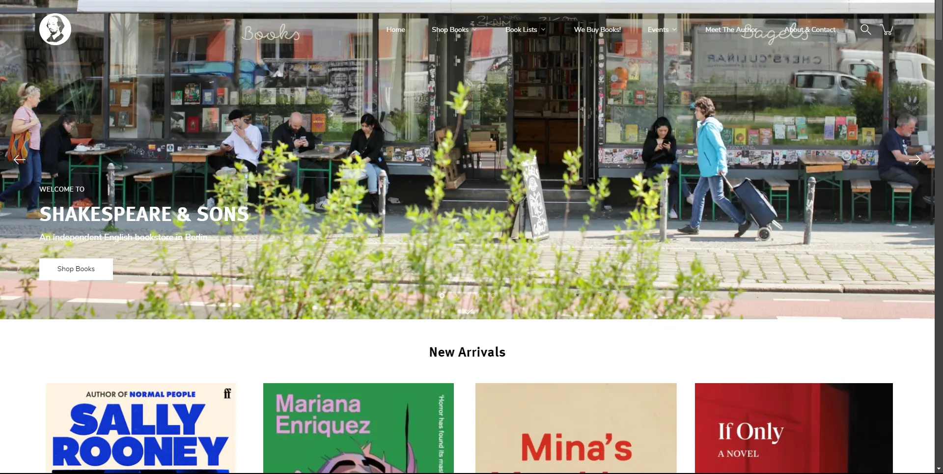
Shakespeare & Sons website
What does it mean to redesign, and what elements can remain unchanged?
In this case study, a team of four was tasked with reaching out to an e-commerce company to propose a redesign for their website. We looked for potential candidates and asked if they might be interested, but only one of them got interested in our proposal.
So we came in contact with Shakespeare & Sons, where we spoke with the owner and his trusted assistant about their unique bookstore, which also serves as a café. The charming establishment is aptly named Books and Bagels.
Throughout June & July of 2024 I participated in a challenge by designcourse.com
youtube channel. Within this challenge came along 13 different challenges.
These challenges were alot of fun to made and I gain some design knowledge and got real feedback on some of my entries, with some of them just needed small
adjustments or others a re-design.
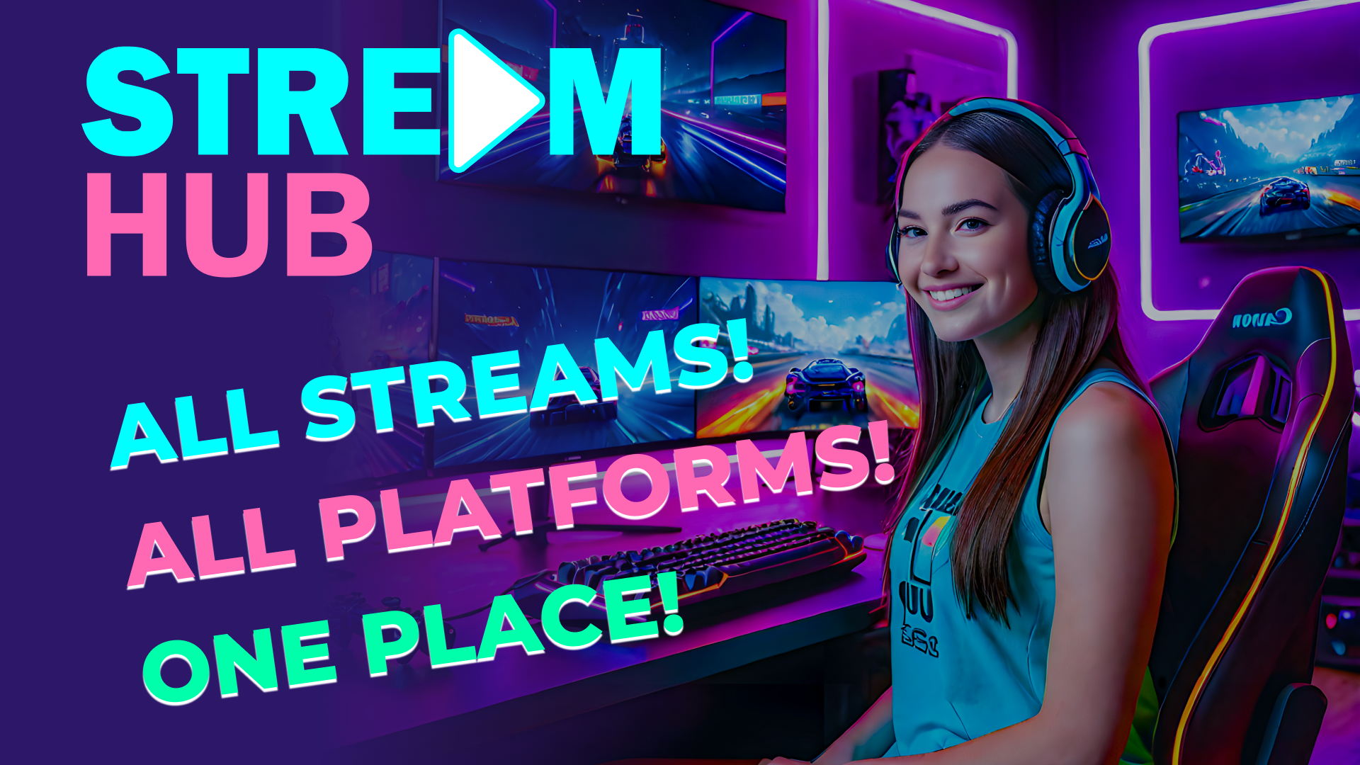
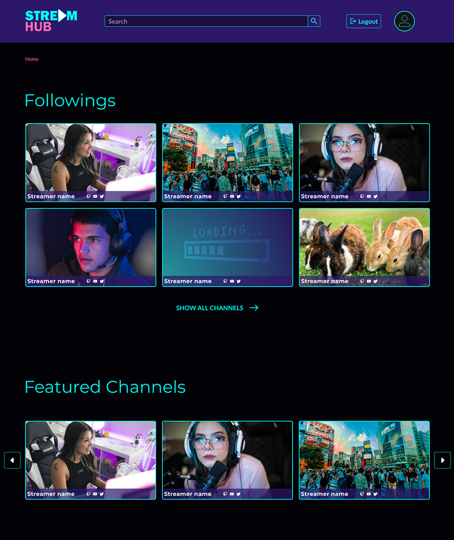
You’re coming across a streamer that you like, but you found the streamer on one platform.
But it turns out the streamer you follow streams also on multiple platforms and even covers your preferred streaming platform.
In another example one streamer uses multiple platforms, but doesn’t stream all the time on certain ones or does not cover the whole stream with platforms.
These problems should be eliminated with the app Stream Hub.
Stream Hub App - Home Page
The App
Stream Hub lists up all streamers with platforms about social streaming such as Twitch, Youtube, Kick and more.
Streamers that would use the app can show all their platforms they’re streaming on and send out “Live” notifications the moment they hit the live button on one platform.
Users can see what platforms their streamer covers and easily choose on what platform they want to watch and get live notifications on their Desktop,
text message to their mobile or as email.
Streams are captured with a thumbnail of the current stream and updates every few minutes.
Only Live Streams that are played are in the Featured (contains 3 different streams) section.
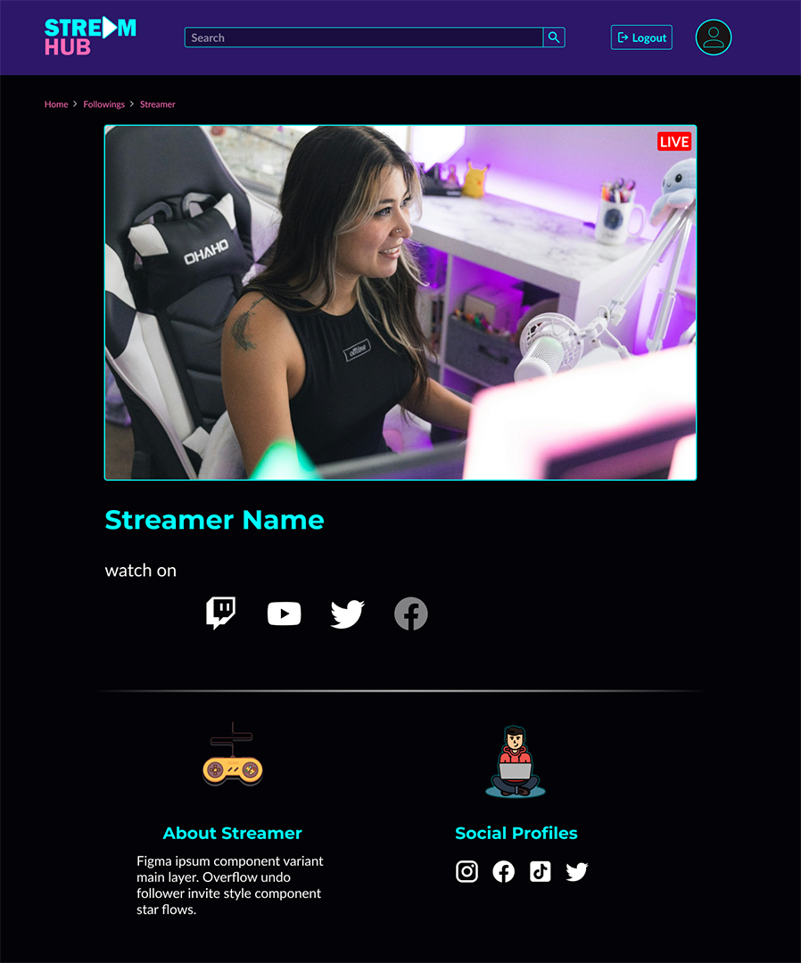
Stream Hub App - Streamer Page
Streamers' profiles are shown as cards and on a personal site. The personal site can be used for introduction and showcasing their social media accounts.
Stream Hub is the companion app to live streaming, to get you closer to your community and streamer.
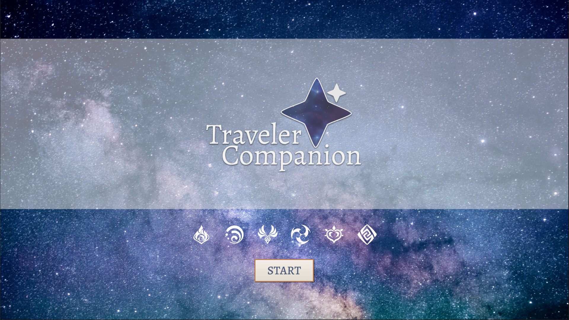
Traveler Companion - Design
16/02/2024
Traveler Companion App Start Page
Genshin Teams App updated version - now called Traveler Companion - has it's design complete.
Some animations and effect will later added to the production version.
Next thing will be some research and trying out. Stay tuned.
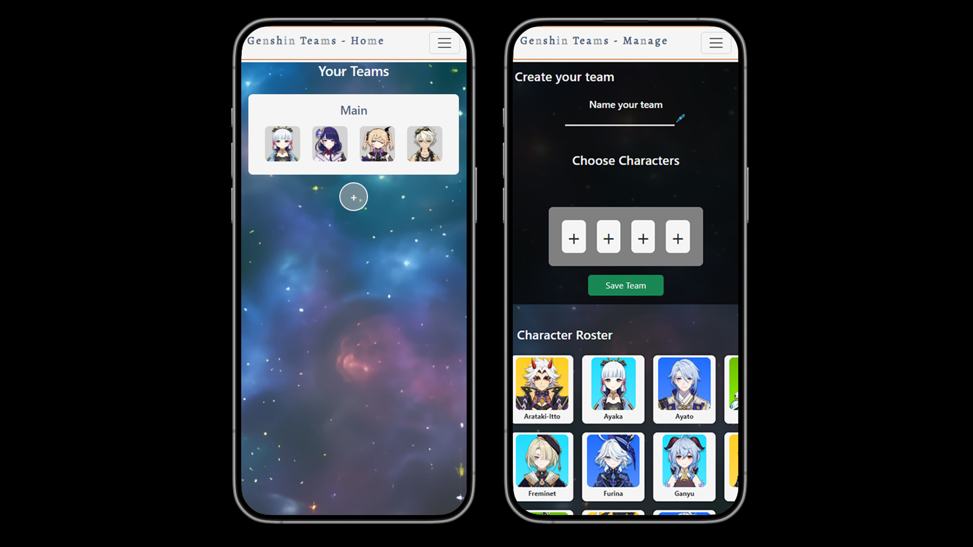
Portfolio Update - Genshin App
06/02/2024
Genshin Teams App Ver. 0.2
Short update on my application 'Genshin Teams'. As I not only updated the App, but also is the app live and got the updated API, I am also attack it one more time
to give it a proper release. Gonna work on the team creation and more. It'll be fun. But it will take a while.
Webflow
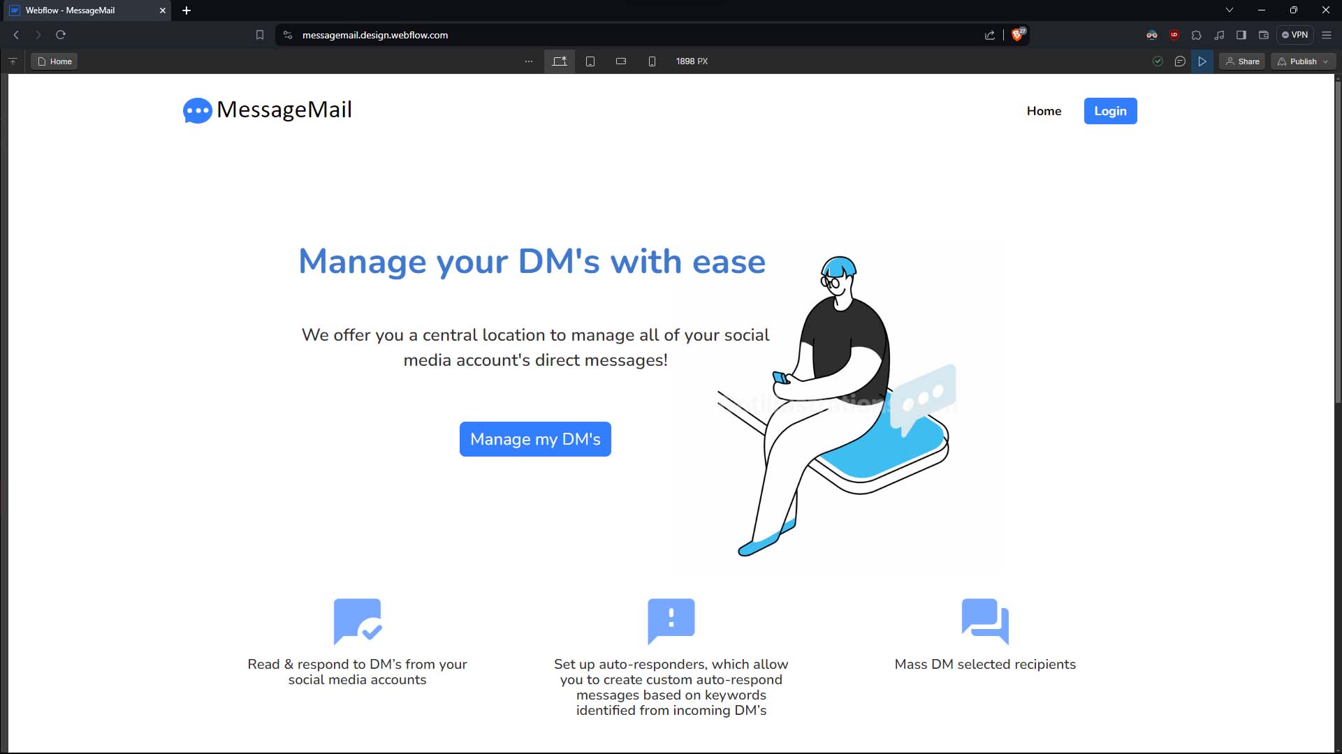
05/02/2024
In Webflow recreated app MessageMail
So I came across the Design Tool (Creation tool?) Webflow. It's works similar to Figma and is easy to use. There's even an Add-On for Figma that can export your
Figma designs over to Webflow. Pretty good actually.
I haven't done much yet in Webflow, but will play around little bit more to try stuff out.
Site goes Figma
19/01/2024
New year, new me! Well kind of. As I made my way through an online course to learn about UI/UX Design I slowly adjusted my design for my website too.
The design course I took was alot of fun and all the stuff I learned from it now goes into the website and future projects. Also some of my older projects
will recieve some love.
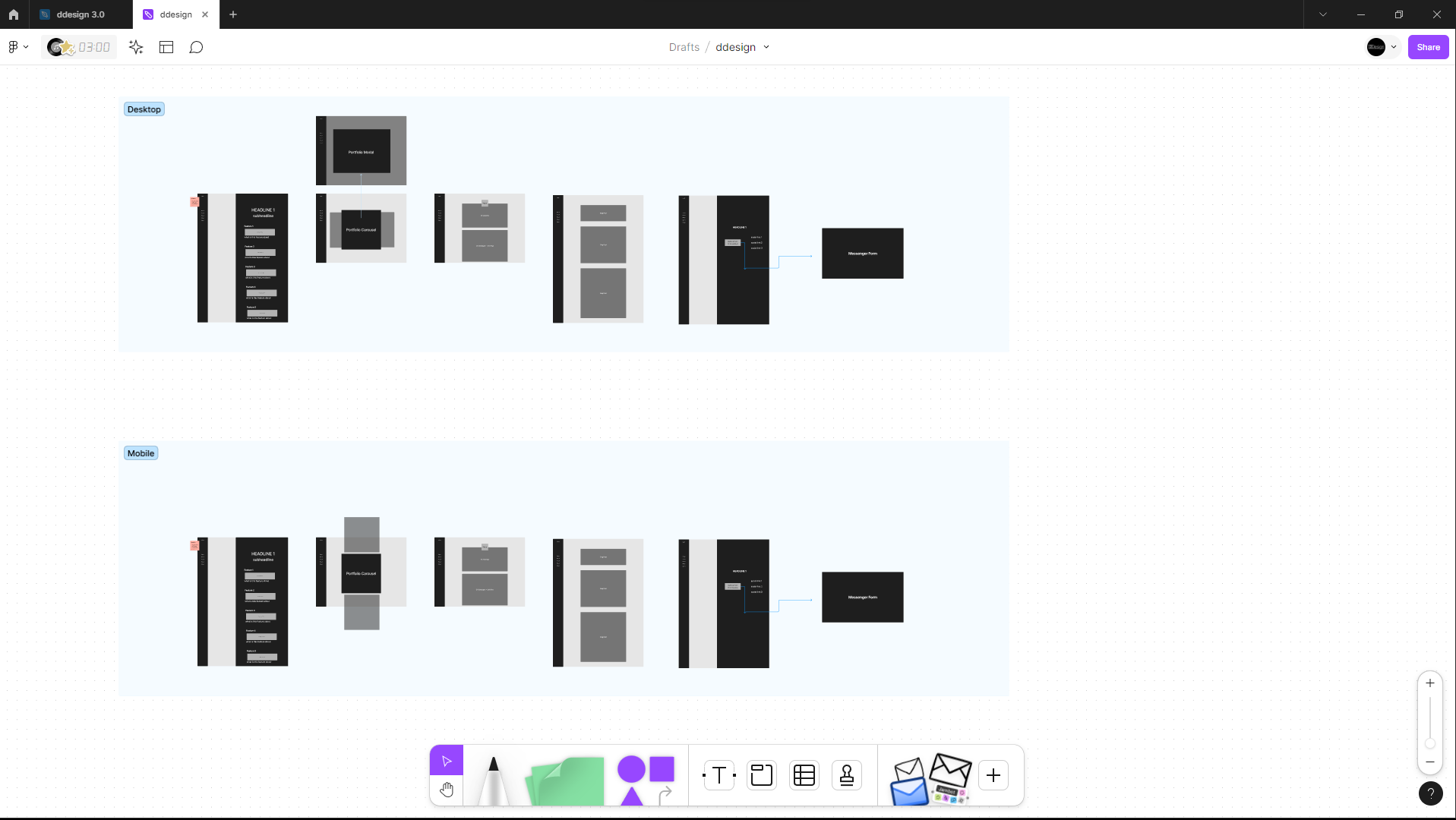
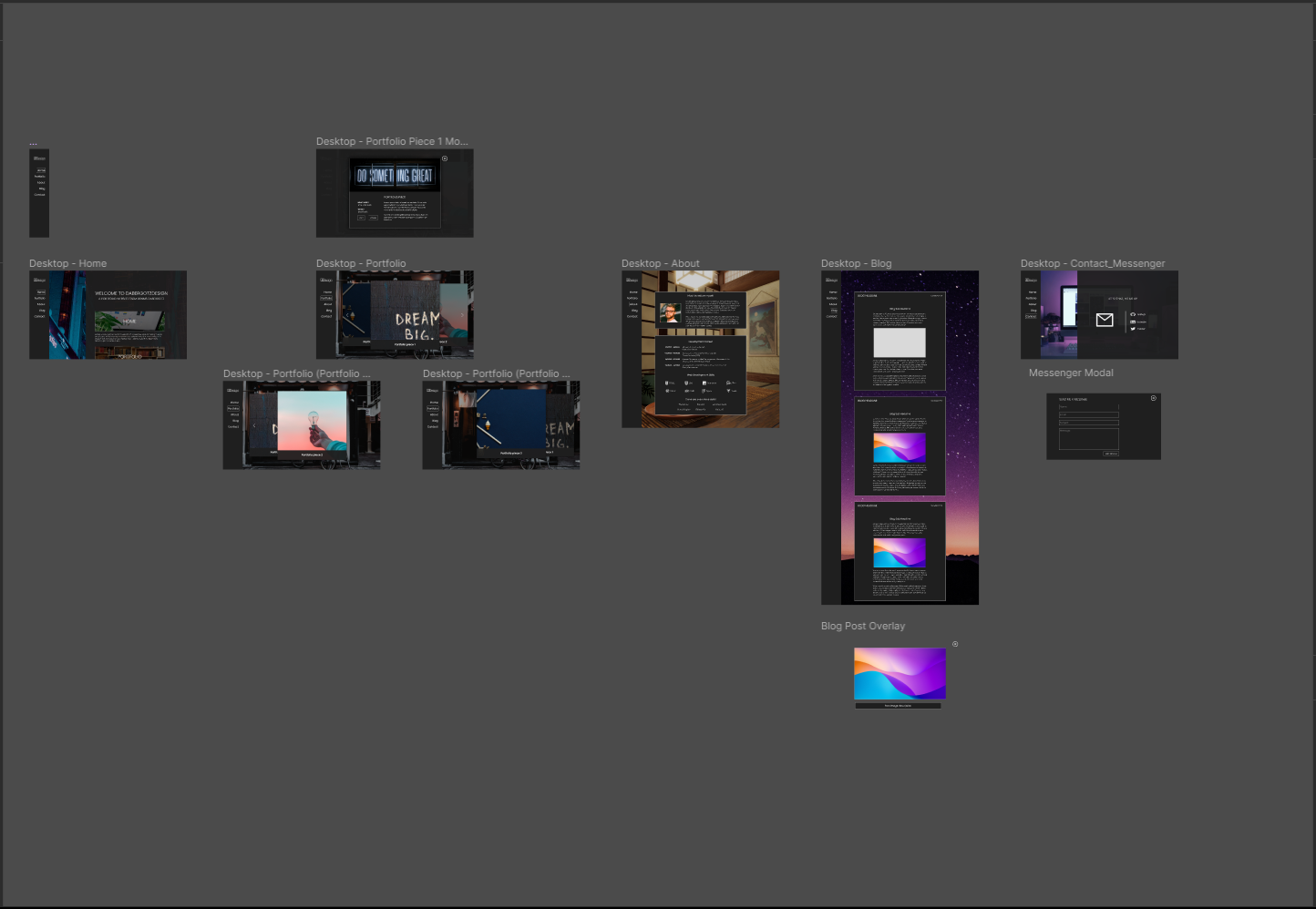
Figma Wireframe
Even though it wasn't really needed I've gone through the whole design process. That means creating a Wireframe first.
Figma Design
Turning this Wireframe into the final design was made pretty quick. Most of the changes I made in the design were just little adjustments in space and alignment of elements.
Other changes were more significant as I completely made a new attempt for these pages. The Portfolio page is what changed the most in the process of this.
Not only the design itself changed, I also go full AI with the background images. I usually would create my backgrounds in Blender, but that changed when I got hands on
an AI image generator. The generated Images are not that perfect [ they're a little rubbish ] , but as backgrounds I think they'll do fine.
Also the process of generating these images over a 3D model is so much faster that I the decision to use the AI images wasn't that hard.
So much for the design update in 2024. Let's see what the year has to offer. Oh and by the way I also changed the address and we're now on a registered domain.
Layout Update 2023
04/08/2023
As you might have noticed a new layout has arrived.
With my newly learned knowledge about web development and a little more on web design, I basically revamped my site.
Where the old version had used basic CSS the updated version now works with SASS and is more responsive and interactive.
The backgrounds will use AI generated images as placeholder until I swapping them out with the rendered backgrounds.
That's all for now, see you next time.
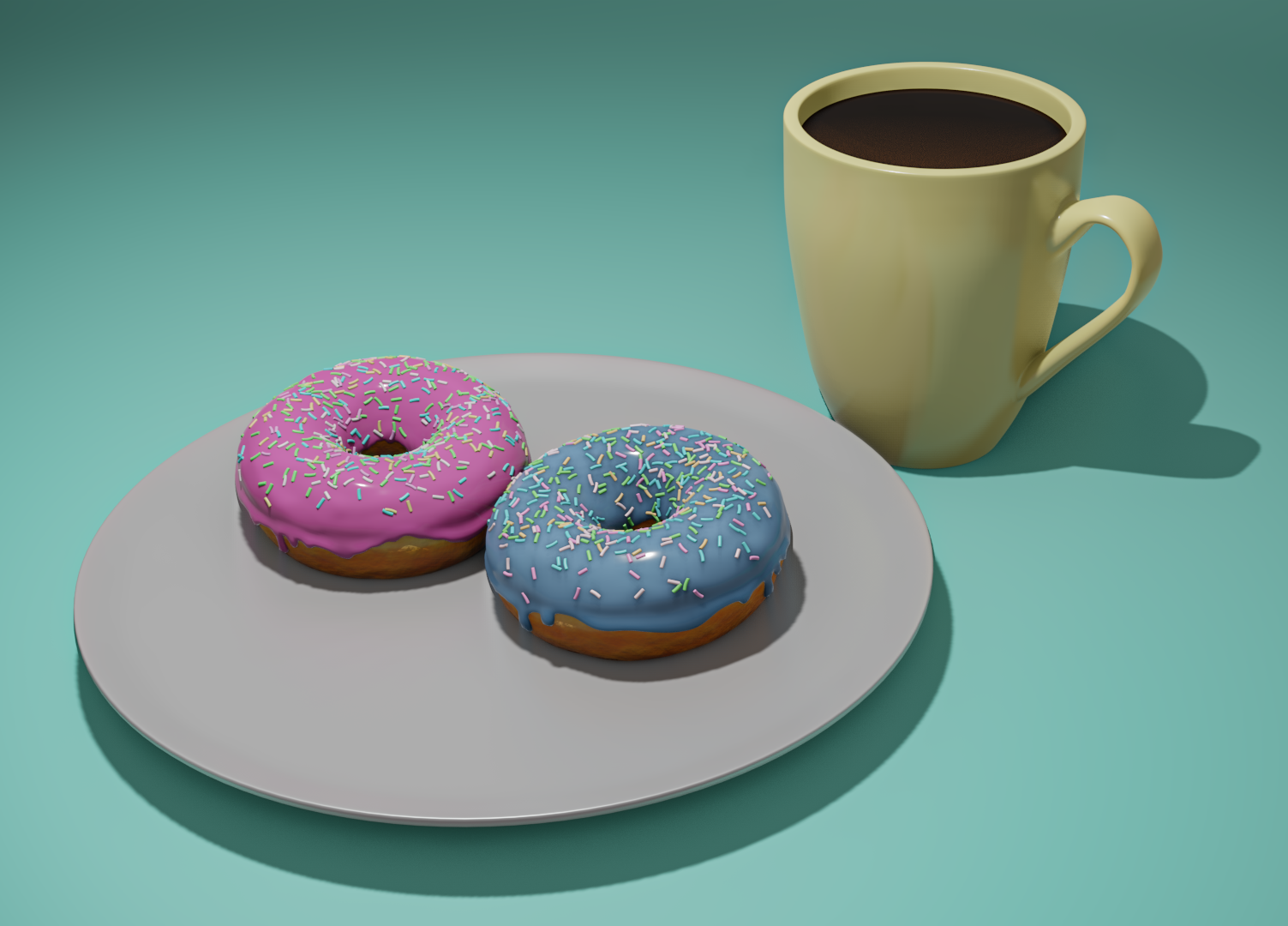
From Maya to Blender
10/10/2022
The Blender Donut
If you make your way to Blender there is no way around on the famous Blender Donut by Blender Guru.
Well I didn't stop there. In my past I've got in touch with Blender just so I could only do a cup of coffee and an other model.
So when I come around to Blender again I obviously had to do that coffee cup again. And this time even with filled.
The move to Blender happened because of a project that got somehow a corrupted file, so the move had to happen a little earlier than I
expected. As for the project itself will be continued later on, just now in Blender. But before that, there will be some training sessions.
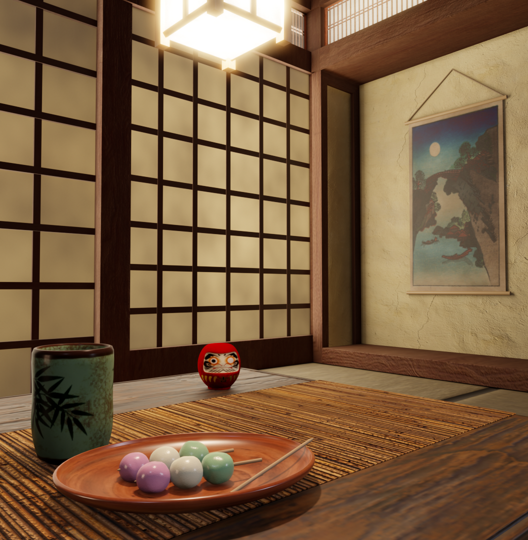
One of those training session projects I made directly after the donut.
A Cosy Japanese Room
To step up the donut, but kind of the same idea, was to build a scene with the japanese sweets called Dangos.
The scene should be more than just a bland background and show more of an believable environment with lighting within the scene.
For the full images of that scene visit here
Really really love Blender so far and I can wait to dig even more in it.
Layout and Style update + Messenger
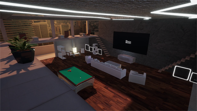
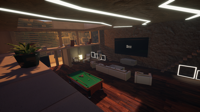
15/02/2022
New Layout and Style Update
After a little while I updated my backgrounds from the Unreal Scene. New Assets had being added to some scenes and
some adjustments to the camera shots had been made. All to provide a better look for the backgrounds and let some added assets shine.
Old DesignNew Design
You may have notices that the text boxes also got changed. Instead of having round corner and a brighter background color,
they now are more edged out and have almost black background. This comes now more in line with the logo of dabergotzDesign and the design idea
I had in mind.
Messenger
A new messenger is now implemented on the site free to use for all the visiters who want to get in contact with me through email.
As of right now the messenger works with Formspree as service, but I'll try to build a messenger without using Formspree, but rather over an API service or nodemailer.
But that will be a thing for later.
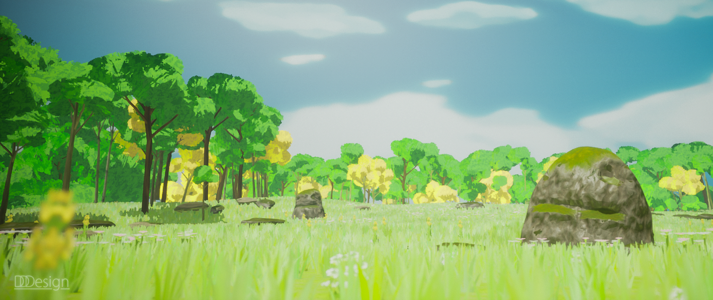
The Meadows - 80lv
29/11/2021
The Meadows are originally from David Holland who shared his work on 80lv.
Inspired by the project I decided to recreate it, as close I could get.
Working and creating with trees and landscape tool with grass and plants were the main focus on making the scene.
Also having a scene that is inspired by Studio Ghibli films and The Legend of Zelda: Breath of the Wild got me hooked.
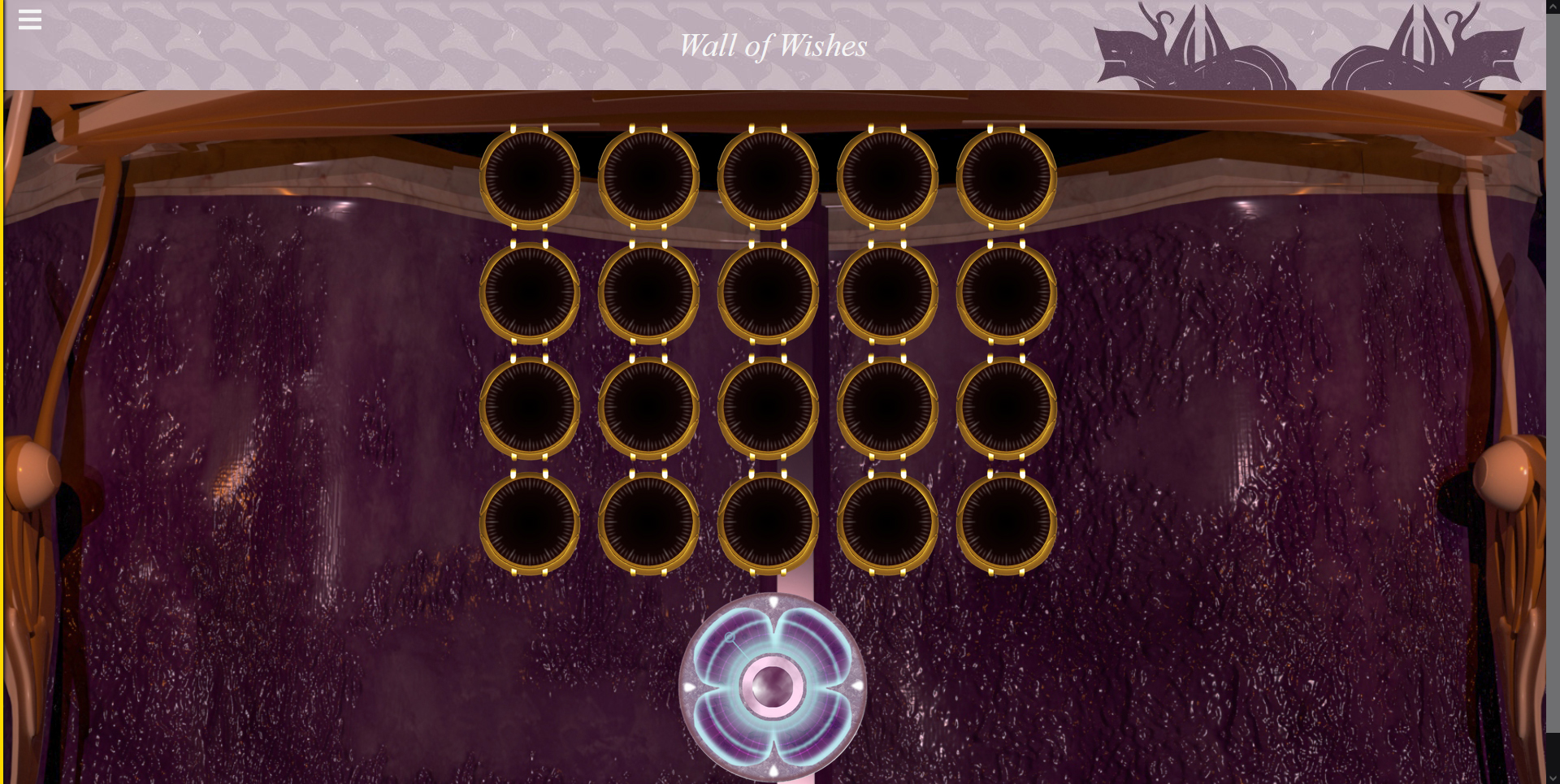
Destiny's Wall of Wishes
26/10/2021
Destiny 2 has a feature that is inside a Raid (a 6 Player activity) which let's you make a 'wish'.
To make a wish you have to shoot panels on a wall. What the effect the wish gives you, is to find out for yourself.
I started the project with the idea to learn more with React and go beyond of the stuff I already know.
Recreating the game feature with React and Javascript, also showing the effects of the wishes as close as possible.
This project turned out so good and gave me the opportunity to work on many Javascript/React stuff that I have not touched before.
A lot of gained knowledge, frustration & enjoyment and fun got into Wall of Wishes.
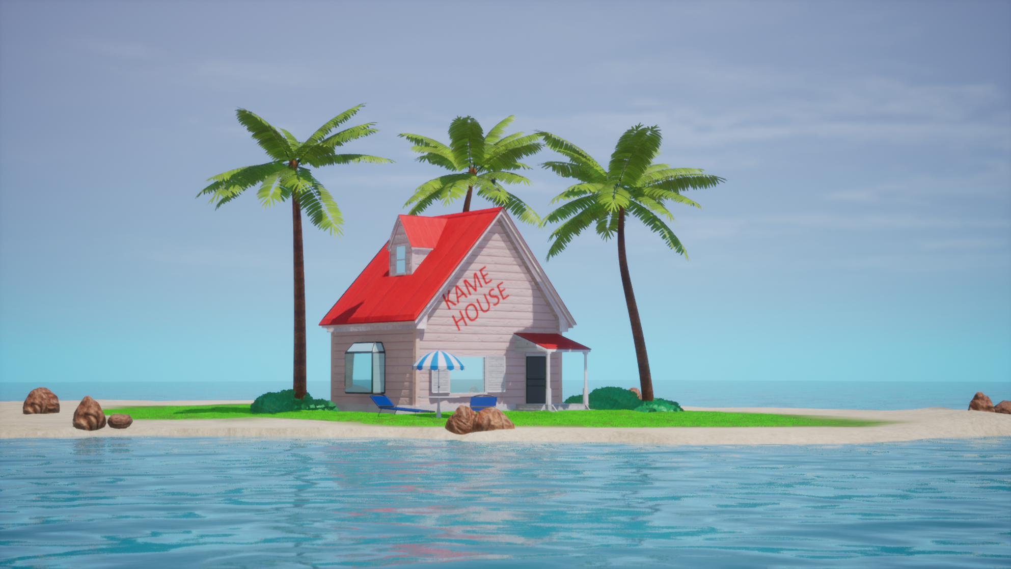
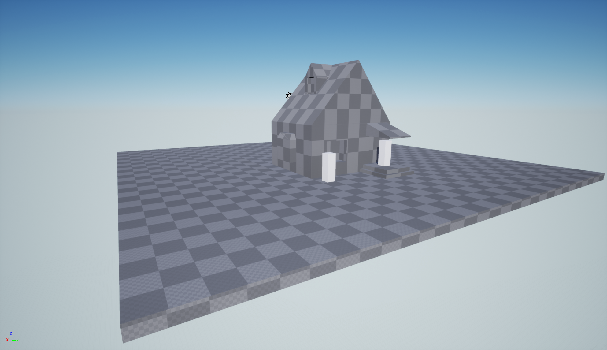
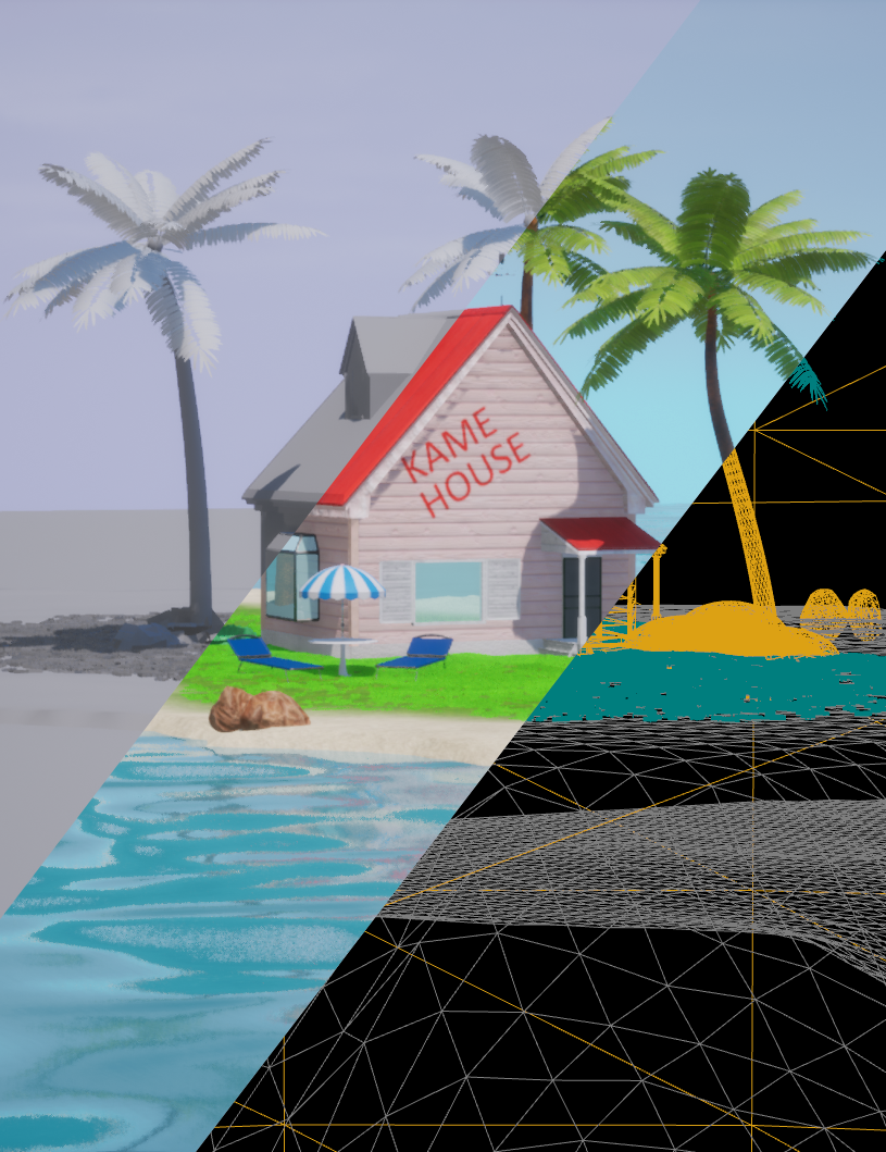
Starting the new year with a new scene in Unreal and learn more about the engine was one of the things I set as a target for the year 2020.
But you can guess what came in between. Together with some motivation holes and projects that where stopped right after the start, I struggled to even touch something.
What I needed to get out of that loop was a simple project to get back into a workflow.
The simplest thing I came up with was the Kame House from Dragonball. I small island, a small House and three palm trees, simple.
Blockout was as fast as Instant Transmission by Son Goku. Same for most part of the modeling.
Had a little stoke when I did the bush assets. But they turn out better than expected.
I came in use of some of the tools that I haven't used before in Maya 3D, which came in handy with the plants.
The texturing was tricky in some parts of the house. But overall with the textures and UVs on this could bring me to a new approach on
how to make better textures.
To make the island I used the Landscape Tool in Unreal Engine, to sculpt the Island. Working with Landscape Tool was also why I choosed to make that scene.
The Landscape was way to big for what I have used of and found out that I can delete parts of it almost at the end of the project.
It is fun to use when everything is set up with it (landscape material for example) and you know what Landscape you try to sculpt.
Love how the project came out way better than I thought. Learn alot with Unreal Engine, make better Materials, Lighting and modeling over all.
The blockout house was slightly smaller than the end-result, also what's not used are plants and the scene fill objects like the sunbrella with table.
A cut through to some layers. Lighting only, complete scene and wireframe
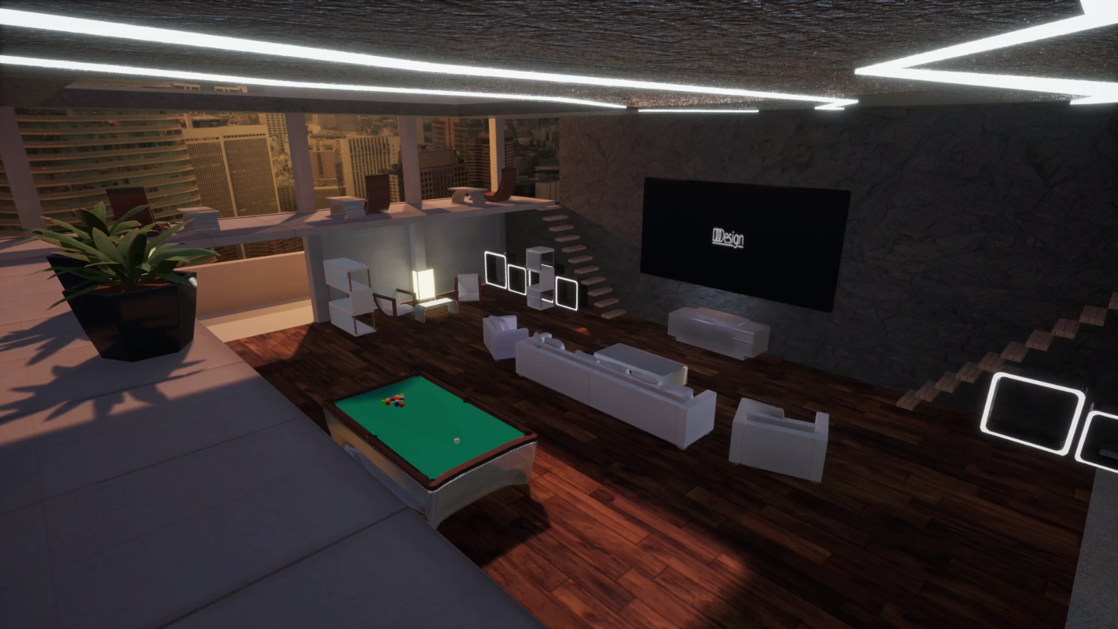
WebDevSim - DCI Final Project
04/03/2020
For the final project for the DCI (Digital Career Institute) I had the idea on a game in which the player will build a website.
<WebDevSim/> is about to teach the basics in web development for people to don't know where to start.
Like in Text Adventures or other text-based video games you have to write things down and interact with the game environment.
I started with a concept art (see image above) where I was looking for an interesting light and room layout.
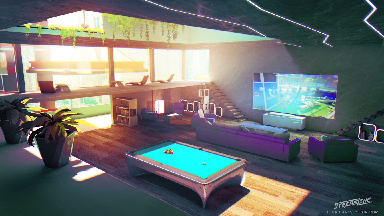
Art comes from Proletariat Inc. from they're game Streamline.
Having in mind doing this scene in Unreal, a modern look & realistic look and had assets with interesting materials were the criteria
that I had in mind for the background theme for my Website.
The scene from the concept art had everything in it, plus with spaces
where I could put my own stuff in there.
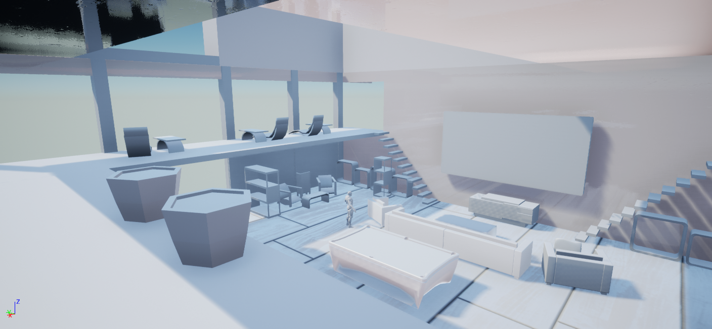
The Blockout phase was quickly done. Some of the models were a good challenge for me, but that's what I've needed to get
a better workaround with 3D Modeling, as I want to get better with it.
The first asset complete build. Since Unreal was relatively new to me, creating these different materials and set them
up in the scene on the models and see how they interact with the lighting. Not gonna lie I had a blast when I made the
material for the stone wall.
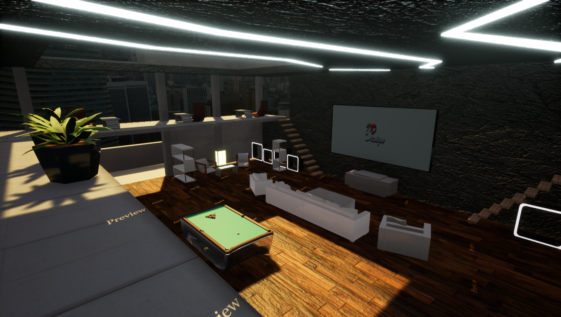
The gallery and the room where the computer is, not seen on the image, were stuff I added to the scene
because I haven't figured out what I could use as a fitting background for the About Me and Contacts section for the
website.
The logo on the TV screen is from the old site style. The video played automatically when in play mode, only thing missing and
make it more believable was the light that would emit from the screen. Trying to animate the color of the light didn't work.
A different approach was to code the light colors. Luckily I found a good tutorial which helped me out. That was a first coding
in Unreal for a project, it's very different from what I am used to. Likely gonna use more coding in future projects.
All must-have assets are in scene, lighting and post-processing had it's final touches. It's done...for now.
The scene itself is complete, but it will have some "live" into it. There are still some empty spaces, also notice
the empty shelves, these will be filled with models.
I'll see the models as kind of "easter eggs" as I choose to put
models in scene that reference to the portfolio pieces and high likely some of my favorite pieces from modeling. But that
is for the future.
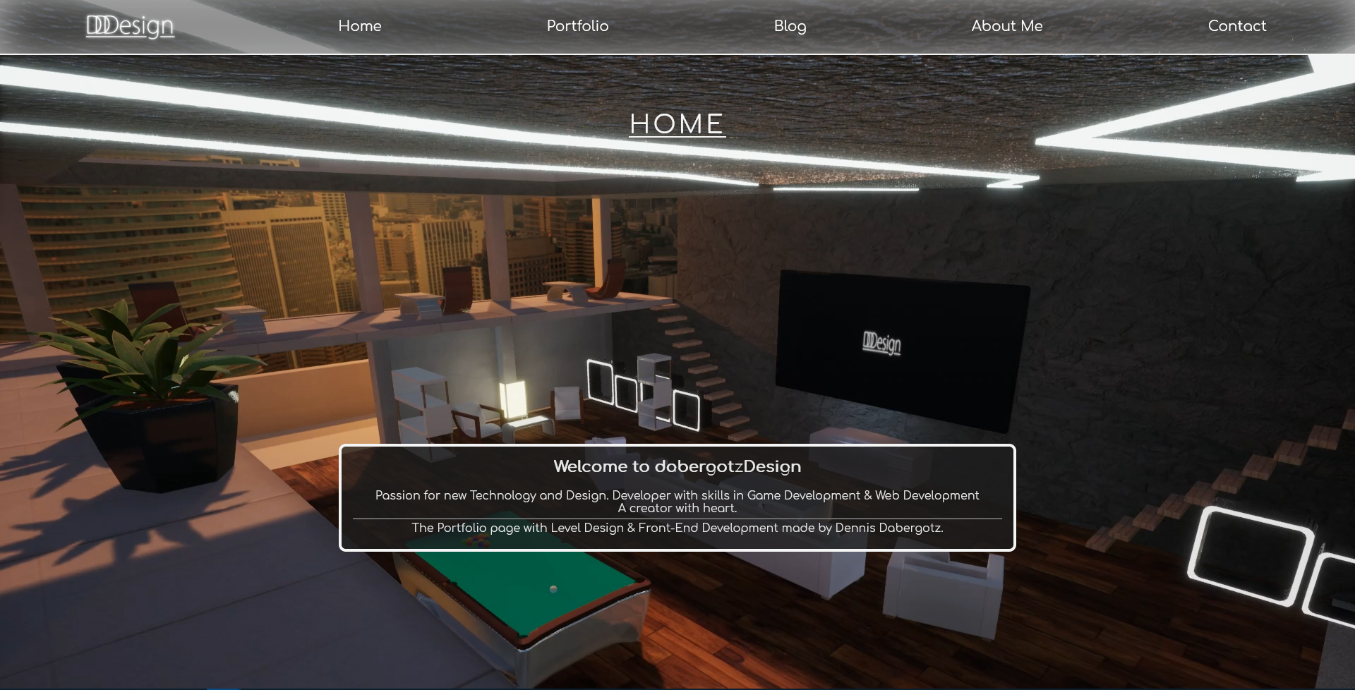
Website: New Year, New Me. Well kind of...
08/01/2020
R.I.P old website.
2017-2019
Now that I am feeling more comfortable with the Unreal Engine, I think it was time to combine these newly learned skills
with Web design.
The background images were all rendered from a scene in Unreal. Having the page elements as an overlay or even be part with
the background itself was a challenge that I gave to myself. What better could be the presentation of a Level Designer and Front-End Developer.
After many platform changes with the old Website, starting as a Jimdo site, then make it in an actual self-made Website and now with the re-design.
For right now this should be the final design choice of my Portfolio Website.
The new site will still have changes. The background images will be filled with more assets, hidden but visible, kind of like Easter Eggs within the scenes.
Most assets will come from the games and websites shown here.